

Hike Ranger Capstone Project
Designing a mobile app that introduces users to extreme outdoor experiences and prepares them for the worst.
Project Goal
Develop a mobile app that allows users to find more extreme outdoor experiences while ensuring they will be prepared for whatever may happen
Challenges
Some people see the outdoor adventures that others go on (usually through social media or travel/nature TV) and have trouble finding similar experiences to embark on
Hikers of all experience levels encounter dangerous situations they are unprepared for but are known to usual visitors in those locations
Mobile apps for hiking/backpacking sometimes lack vital information which can make users unprepared for the outdoor experience they’re expecting
Process
User research (screener surveys, user interviews, affinity mapping, empathy mapping, personas)
User journeys & user flows
Sketches & wireframing
Low and high fidelity prototyping
Usability testing (two rounds, two iterations)
Results
Developed a workable prototype that addressed challenges commonly encountered by users of other hiking/outdoor adventure mobile apps
See the prototype here
Hike Ranger Capstone Project Background
My goal with Hike Ranger was to provide a more collective experience for new and experienced hikers. As a hiker who seeks out more dangerous and intensive hikes such as those atop active volcanoes or in remote areas with dangerous wildlife, I found that many of my peers either didn’t know these hikes were an option or would go after seeing my photos but be completely unprepared.
As my first capstone in the Springboard UI/UX Design boot camp, Hike Ranger was an in-depth exploration in the research and design methods used to bring a product to fruition. The initial exhaustive research stages helped to impact the design of the end product, a working high-fidelity prototype that users felt would help them find unique and off-the-beaten-path hikes and how to best prepare themselves.
Users and Audience
After compiling the data gleaned from the screener survey, I found that our target audience was aged 24-30, spanned all genders, majority Causasian and/or East Asian, and heavy mobile (iOS in particular) users who often rely on their phones to browse and find what activities to do. The diverse audience included hikers of all experience levels, but in the end I didn’t feel that information about race was necessary. My main drivers here were age and which platform users used the most to browse hiking information and find new hikes.

Using the results of my screener survey, I was able to capture important information regarding potential users of my app.


Note: As part of the Springboard UI/UX design course, data on race was required to be collected to inform design decisions. I personally did not feel the need to include information about race when it came to users of a hiking app.
Roles and Responsibilities
I worked on this project alone with support from my Springboard mentor. Outside help and advice was required to judge and gauge fine details, but I created the app visuals and designed the experience.
Roles I carried out included those of UI/UX designer, user researcher, interviewer, and product manager.
Scope and Constraints
Due to this project being conducted during the COVID crisis, all usability testing as well as user interviews needed to be held remotely. I was able to recruit my housemates for some guerrilla testing in the hallways. A small number of testings and interviews happened across time zones as well.
The Process
As a UI/UX designer working solo on this project, I needed to conduct my own research which would eventually guide my design process.
Research
Secondary Research
Once the problem was identified, I set out to find detailed information related to outdoor and hike safety as this was the dividing factor between Hike Ranger and existing hike apps.
I took insights gathered from research papers relating to the most common types of injuries and accidents in the national park system as well as information regarding outdoor and hiking hazards. This would help to inform the safety page for Hike Ranger as well as risks associated with specific hiking locations.
Screener Survey
A survey was sent to the Springboard Slack community as well as my personal network to identify potential candidates for interviews. Five interviewees were selected and yielded valuable information about how they go about planning their own outdoor activities. The significance of needing just five interviewees was due to an article I’d gleaned early on about how most usable input gathered during user interview could be collected after only four rounds of interviewing.
Affinity Mapping
After gathering 30 responses to my screener survey, I went about selecting individuals from all experience levels with hiking, genders, ages, and nationalities. I scheduled remote interviews over Zoom and asked the interviewees about their experiences hiking and finding new places to hike.
Taking the insights gathered from these calls, I wrote a post-it for each data point collected and started to group them based on their similarities. Once I had all post-its on the wall, I labelled each group and used this organization to begin working on personas and empathy maps. Affinity mapping helped to make sense out of the chaos of all the data collected from the interviews.

Individual data points from each interview were recorded on post-its, grouped with like data, and categorized by grouping (pain points, criteria, etc.)
Empathy Mapping & Personas
The interviewees provided an interesting insight as to how our target audience might be. Given that there were two distinct groups of personalities in the interviewees, two personas were created to reflect the desires of a potential user.
Empathy mapping is a way to distinguish between what is said, felt, heard, and done as well as pain points and motivations. Grouping the data from each interviewee in his/her respective persona, I was able to describe how each persona felt about their outdoor planning experiences.


The Jenny persona would like to get into the outdoors more, but her limited free time after work and being with friends keeps her from doing so.

The Michael persona feels the need to get some outdoor time as well, but he’s usually too tired after work to do so.
User Stories
The empathy maps yield information about the desires of each persona, so a set of user stories (with a “As a user, I’d like to [do something]” format) was created to identify potential red routes and most likely paths a potential user might take on the app.
For example: “As a first-time hiker in Glacier National Park, I’d like to know what types of dangerous wildlife I can expect on the trail I chose.”
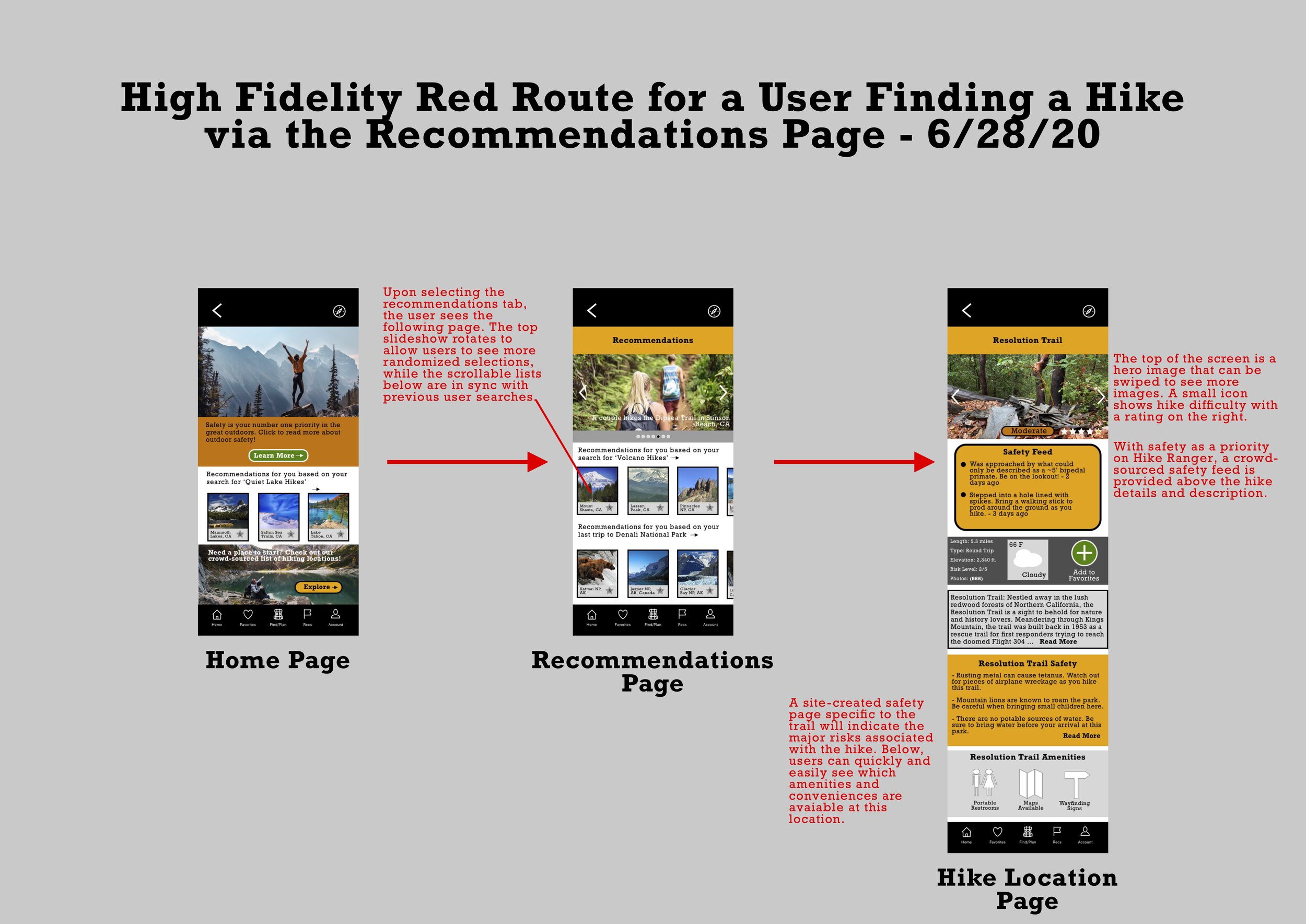
User Flow
Taking the user stories, I was able to create a user flow diagram showing the navigation of a red route (routes to be taken by the majority of users) and decisions available to be made by a user to complete it.

The user flow helps me to identify the user route and pages needed to complete the route.
Sketches and Wireframing
Simple pen and paper sketches were created to set up the basic foundation for the app’s appearance. Each page along the red route was sketched and then placed into a wireframe to show the appearances of screens that’d be used along the red route.

Multiple sketches shown in my notebook. I found that drawing them alongside one another helped to better visualize the flow they would eventually follow.

The sketches are made into screens which can then be used to visually piece together the user journey.

Visual Design
Design System & Style Guide
With the initial research stage complete, it was time to decide how the app would appear visually. Using an online color palette compiler, I found a suitable palette that would reflect the sense of the outdoors as well as that of the US National Park Service.
Fonts, grids, and all other visual details were created at this time. The design system, along with a mood board, allowed me to clearly define Hike Ranger’s attitude and stance towards the outdoors and its potential users.

Each page of the style guide laid out the theme and reasoning of everything ranging from colors to type.


Prototyping & Testing
High-Fidelity Mockup
Using the principles outlined in the style guide, I set out with finally piecing together Hike Ranger with Sketch and InVision. The color palette was applied to the app’s low-fidelity interface. In addition, I created mockups for edge use cases and red routes.
An accessibility audit and a color contrast audit were performed using grayscale and the WebAIM, respectively, and small adjustments being made to address the contrast issues that were brought up.


User Testing & Iterations
The first high-fidelity prototype was presented to five participants. Issues brought up on the first round included the home page being too large and unclear, safety information taking precedence over hiking, and lack of a search bar.
With these issues addressed, a second high-fidelity prototype was created and tested. This final prototype yielded less issue with users. Both sets of tests were moderated and remotely conducted via Zoom and InVision.

The final version of the home screen. All users tested wished that there was a search bar. They also preferred that the safety banner be swapped with the recommendations in order to more easily find their recommended hikes.

In the first iteration of the home screen, users expressed frustration at not having a search bar tool made available.
Outcomes and Lessons
The final prototype had come a long way since the initial research and ideation stages of Hike Ranger. From my first-ever UI/UX design project, I learned to put the needs of the user before myself. For example, while I felt that a safety page would be good reading and useful to hikers unsure of what to prepare, many felt that it could be relegated to a small banner less obvious on the homepage.
The main surprising discovery was that the inclusion of a search bar negated both red routes relating to finding a new hike. While it seems that many users wanted to be able to discover new trails, they’d often approach apps like this with places in mind. My goal was to create a new experience in searching for more adventurous and extreme hikes, and in running my final round of usability testing I was grateful to hear from test participants that they would certainly use a hike such as mine to carry out their searching, planning, and preparation needs.